This week's Fix-it-Friday challenge over at iHeartFaces was this lovely couple, enjoying each other's company in a nice woodsy setting. I have to admit, I'm a little jealous of them as I'd much rather be hanging out with them instead of suffering through this New Year's Day cold, staring out the window at the windblown rain. However, since my terrible plight won't help anyone learn any Photoshop tricks, let's move on to the photo...
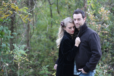
The original image looked a little cold to me. She looks as though she's clinging to him not in affection, but instead she's looking for a little warmth since she decided to opt for the light-weight but pretty jacket instead of the sensible and warm wool jacket that he's wearing. Let's see if we can take her chill away and perhaps impart more of a sense of passion instead of a slight chill.
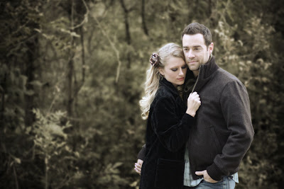
Here's the "fixed" image. Now, instead of "I feel so cold. Hold me to the end," it imparts more of a "I'm sorry Steve, I should have realized that it was your last beer before I drank it. I can't afford to lose you. Please forgive me. I'll never do it again." (I figure that it has to be an apology, since she's clinging to passionately to him while he's apparently weighing his options.)
Now, to take the goose bumps out of the equation and let Steve decide if she's worth keeping, or if the beer was the last straw.
First and foremost, copy the background into a new layer by dragging the "background" layer onto the "new layer" icon in the layers panel and hide the bottom-most layer. This will protect your original image in case you really screw things up, or if you need an un-doctored copy for a new layer later on. I consider this step number one for every image that I work with. If I could make Photoshop automatically do this every time I start a new project, I would. Now that I think about it, I'm not even going to consider this "step one" since it should be required.
Keeping that in mind, the first thing I did was create a Hue/Saturation adjustment layer to desaturate the image some and give it a sepia overtone. I set the Hue at 44 (for a light brown color) the Saturation at 25 and left the lightness at 0. I took the opacity of the adjustment layer down to 62% to bring some of the original colors back into the image since I wanted more of a colorization instead of a monotone.
Desaturating the image took away some of the contrast between the subjects and the background as it was the green of the foliage that separated the two in the original. To counteract that, I added a Brightness/Contrast adjustment layer and set the Brightness to -21 and the Contrast too 100. This layer was then put between the image and the Hue/Sat layer.
The background seemed to be a little too distracting with all the busy branches and leaves, so I gaussian blurred the entire image with a radius of 10 pixels. "Wait, the entire image?" you ask. Yep. "Doesn't that give you blurry people too?" Yep. Remember how we're working on a copy of the image, and how we saved the untouched original background image? Something like that would come in pretty handy right about now, wouldn't it? See where I'm going with this..?
I made another copy of the bottom-most (hidden) layer and dragged it to the top of the layer stack. Presto, un-blurred people. Now to cut them out so we can see the magic that I previously worked on the background. Knowing that I was going to reduce the image size by 80% after I was done, I wasn't too worried about the absolute precision of the cut-out since any roughness would be lost when I shrunk the image. I used the pen tool to outline the couple, switched from the "Layers" panel to the "Paths" panel by clicking the tab at the top of the panel, then right clicked "Work Path" thumbnail and chose "Make Selection." Switching back to the "Layers" panel, I clicked the "Add Layer Mask" icon at the bottom of the panel. This hid the background and left our subjects, un-blurred and untouched by the adjustment layers below them. I renamed this layer "people" by double clicking the layer name.
Unfortunately, we now have a cold couple, sticking out like sore thumbs on a nice background. To remedy this, I added another Hue/Saturation adjustment layer on top of the couple and clicking "Ok." Since I didn't want this adjustment to effect the background layers, I linked it to the "people" layer by Alt-Clicking the line between the adjustment layer and the "people" layer. Double clicking the black and white circle on the newest Hue/Sat layer will bring up the adjustment options. I set the Hue at 44 to bring the couple into the color range of the background and left Saturation at 50 and Lightness at 0.
I still wasn't happy with how distracting the background was, so I added a vignette. "Adding a vignette" sounds difficult, but in reality, it's just darkening the edges of an image. Sounds fancy, looks good and easy to do. Nice. I selected the blurred background image, clicked the "Filter" menu at the top of the screen, and went to Distort>Lens Correction. I set the Vignette amount to about -74 and the Midpoint to about +34. Wanting to pull the background just a bit farther in to the, well, background, I added a linked Hue/Saturation layer to the background image and set the Saturation to -72. Now, I know that I could have probably tweaked the other Hue/Sat layer for a while to get the same look, but I found it easier to just add this additional adjustment layer to focus on getting the background saturation just right.
Since the final use of this image was for the web, I wanted to save space and speed up the loading for my viewers. I reduced the image size to 20% and made sure that it was at 72 dpi. This is a step that I notice that a lot of bloggers don't consider when they upload their pictures. Unfortunately, this leads to extremely long load-times for their pages as they're usually pretty picture-heavy. Leaving pictures at full size and full resolution can easily lead to pictured that are 3 megabytes or larger. Multiply that times however many pictures there are per page and all the sudden it takes a blog post several minutes to load instead of just a few seconds. For example, the original image that I downloaded, at full size was over 5 megabytes which could take up to seven minutes to download over an average internet connection like you might have at your home. Resizing the image brought that down to just under 2Mb, instantly cutting that download time in half.
Reducing the image size also hid the cruddy job I did when I cut out the subjects to separate them from the background. This was pre-planned and intentional.
To save the image for posting to the web, I went to File>Save for Web and Devices and used the following compression settings: JPEG, Optimized, High and Quality 60. Looking at the side-by side comparison of the original and compressed images, the compressed image didn't show enough artifacting to degrade the image, even though it reduced the file size to 68kb and download time to about six seconds.
Now with the chill gone, focus brought back to our couple and everything shrunk down to a more manageable size, our buddy Steve has been able to make his decision. After all, even though she drank his last good beer, she was wise enough to check the weather and see that the weather would warm up enough that she didn't need a heavy wool jacket to keep comfortable. Besides, he's never found a girl that's willing to put up with his buddies and let him watch football without complaining. Who knew that a little Photoshopping could save a relationship?
1 comment:
great job! You should do this more often!
Post a Comment